Book Value vs. Market Value Exposure Report
It is important for a capital business to understand the exposure on its books. Here is a quick visualization of exposure vs. market value using matplotlib.
Book Value vs. Market Value
The book value of an asset is the value recorded on a company's balance sheet. This value typically decreases at a known amount every year due to depreciation, which is calculated based on the appropriate accounting guidelines. Typically the starting book value is the purchase price, and then the asset is depreciated according to a schedule.
The market value of an asset is what it is actually worth. Since the only way to truly know the market value is to sell (or buy) an asset, companies typically solicit the services of a certified appraiser to determine the market value under certain assumptions. Appraisers can also forecast what the market value will be at a point in the future.
The exposure is what you stand to lose, which in this case would be the book value minus the market value. If we had to sell the asset, our loss would be this difference. Since market value lower than book value would result in a loss if the asset is sold, we may want to monitor or forecast this exposure.
Visualizing Exposure
Motivated by this example, let's visualize the exposure for an asset. Here is some dummy data for the book and market value of our example asset:
book = np.array([ 91.36,  89.86,  85.35,  80.84,  76.34,  71.83,  67.32,  62.81,
        58.3 ,  53.79,  49.28,  44.77,  40.27,  35.76,  31.25,  26.74,
        22.23,  17.72,  13.21,   8.7 ,   4.2 ,   0.0  ,   0.0  ,   0.0  ,
         0.0  ,   0.0  ,   0.0  ,   0.0  ,   0.0  ,   0.0  ,   0.0  ])
market = np.array([ 69.7 ,  67.47,  64.63,  62.01,  59.24,  56.78,  54.14,  51.92,
        49.39,  46.83,  44.53,  42.26,  40.43,  38.75,  37.16,  35.62,
        34.15,  32.65,  31.08,  29.61,  28.12,  26.78,  25.13,  23.78,
        22.58,  21.29,  20.01,  18.81,  17.76,  16.91,  16.15])
First, we calculate the year at which the exposure reverses. Since we don't know if book value or market value is greater to start off, we test both cases:
# calculate yearFlip (when curves cross)
yearFlip = False # in case they never cross
if book[0]>market[0]:
    start = 'Below'
    for i in range(len(years)):
        if market[i]>=book[i]:
            yearFlip = years[i]
            break
elif book[0]<market[0]:
    start = 'Above'
    for i in range(len(years)):
        if market[i]<=book[i]:
            yearFlip = years[i]
            break
With this year known, we can plot the book value and market value curves:
ax.plot(years, book, color='#005EB8', solid_capstyle='round', ls=':')
ax.plot(years, market, color='#005EB8', solid_capstyle='round')
We want to shade between these curves to clearly indicate whether our exposure is positive or negative for any point on the curve. Naturally, if red the market value is below our book value. We will use the matplotlib fill_between method to do so.
# fill between:
ax.fill_between(years, book, market, where=book >= market, facecolor='red',
                alpha=.5, interpolate=True)
ax.fill_between(years, book, market, where=book <= market, facecolor='green',
                alpha=.5, interpolate=True)
Next we will annotate the first year in which the exposure is reversed:
if yearFlip==False:
    pass
else:
    # plot yearFlip
    ax.annotate(yearFlip,
                xy=(yearFlip, book[np.where(years==yearFlip)]), xycoords='data',
                xytext=(25, 25), textcoords='offset points',
                arrowprops=dict(arrowstyle="fancy",
                                fc="0.6", ec="none",
                                connectionstyle="angle3,angleA=0,angleB=-90"),
                horizontalalignment='center', verticalalignment='bottom')
Finally, we include a legend:
from matplotlib.lines import Line2D
legend_elements = [Line2D([0], [0], color='#005EB8', lw=3, ls=':',
                          label='Book Value', solid_capstyle='round'),
                   Line2D([0], [0], color='#005EB8', lw=3,
                          label='Market Value', solid_capstyle='round'),
                   Line2D([0], [0], marker='o', color='#005EB8',
                          label='Current Market Value', markeredgecolor='w',
                          markersize=7, solid_capstyle='round'),
                   Line2D([0], [0], color=market_color, lw=3,
                          label='Current Exposure', solid_capstyle='round'),
                  ]
ax.legend(handles=legend_elements, loc='upper right', fontsize=8)
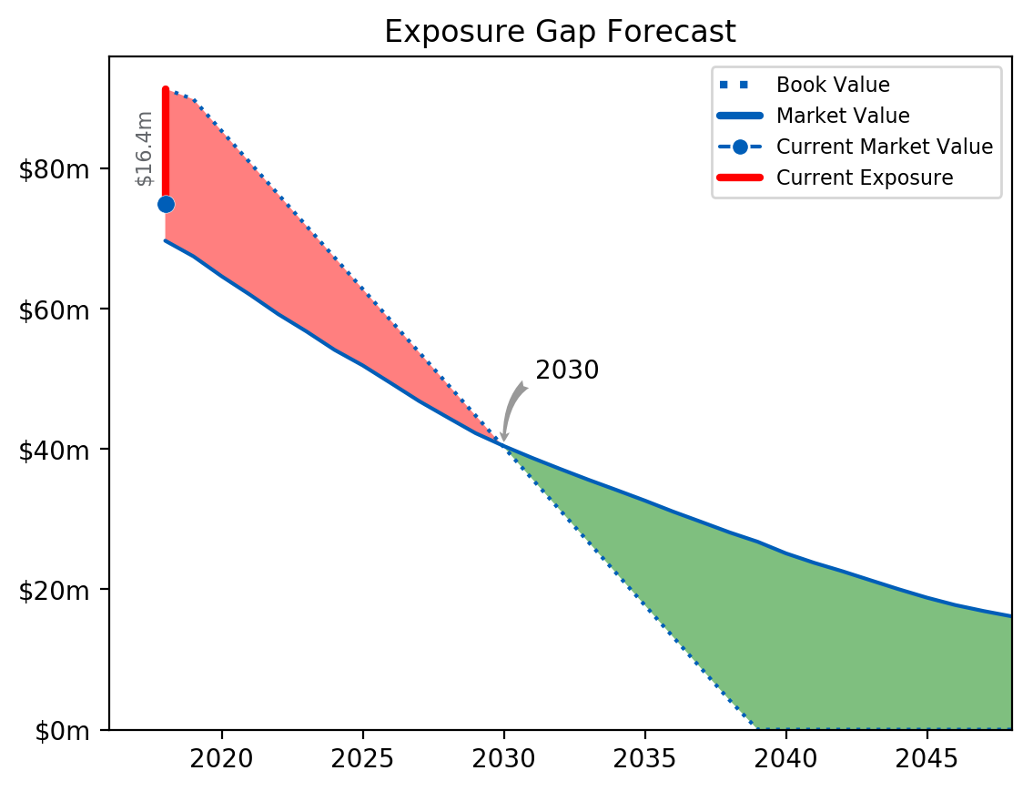
Here is our final chart:
For this particular example asset, we see that we are currently exposed, and if depreciation and market values play out as expected we will be until 2030. Therefore, we would want to avoid selling this asset before then to avoid taking a loss, and we hope that in the meantime we are generating revenue with it.
Here is the full code (or download here):
import pandas as pd
import numpy as np

import matplotlib
import matplotlib.pyplot as plt

import datetime as datetime
date = datetime.datetime.now().date()
currentYear = date.year


def plot_exposure(years, book, market, CMV, currentYear):
    """
    Plots a single book vs. market gap analysis.

    # INPUT -------------------------------------------------------------------
    years               [np.array]
    book                [np.array] array of book/exposure going forward
    market              [np.array] array of appraiser values (future curve)
    currentYear         [int]
    CMV                 [float] current year market

    # RETURN ------------------------------------------------------------------
    plot
    """

    fig = plt.gcf()
    fig.clf()

    # calculate yearFlip (when curves cross)
    yearFlip = False # in case they never cross
    if book[0]>market[0]:
        start = 'Below'
        for i in range(len(years)):
            if market[i]>=book[i]:
                yearFlip = years[i]
                break
    elif book[0]<market[0]:
        start = 'Above'
        for i in range(len(years)):
            if market[i]<=book[i]:
                yearFlip = years[i]
                break

    fig, ax = plt.subplots(1, 1)
    ax.plot(years, book, color='#005EB8', solid_capstyle='round', ls=':')
    ax.plot(years, market, color='#005EB8', solid_capstyle='round')

    # plot market and diff
    if CMV < book[0]:
        market_color = 'red'
    else:
        market_color = 'green'
    ax.plot([currentYear,currentYear],[book[0],CMV], lw=3, color=market_color,
            solid_capstyle='round')
    ax.plot(currentYear, CMV, marker='o', markersize=7, color="#005EB8",
                 markeredgecolor='white', markeredgewidth=.2)
    ax.text(currentYear-0.75, (CMV+book[0])/2,
            '${}m'.format(round(abs(CMV-book[0]),1)),
            rotation=90, color='#63666A', fontsize=8, ha='center', va='center')

    # fill between: https://matplotlib.org/examples/pylab_examples/fill_between_demo.html
    ax.fill_between(years, book, market, where=book >= market, facecolor='red',
                    alpha=.5, interpolate=True)
    ax.fill_between(years, book, market, where=book <= market, facecolor='green',
                    alpha=.5, interpolate=True)

    if yearFlip==False:
        pass
    else:
        # plot yearFlip
        ax.annotate(yearFlip,
                    xy=(yearFlip, book[np.where(years==yearFlip)]), xycoords='data',
                    xytext=(25, 25), textcoords='offset points',
                    arrowprops=dict(arrowstyle="fancy",
                                    fc="0.6", ec="none",
                                    connectionstyle="angle3,angleA=0,angleB=-90"),
                    horizontalalignment='center', verticalalignment='bottom')

    # axes format
    ax.xaxis.grid(False)
    ax.yaxis.grid(False)
    plt.xlim([currentYear-2,years[-1]])
    plt.ylim(ymin=0)

    # $ format
    import matplotlib.ticker as mtick
    yticks = mtick.FormatStrFormatter('$%1.0fm')
    plt.gca().yaxis.set_major_formatter(yticks)

    # legend
    from matplotlib.lines import Line2D
    legend_elements = [Line2D([0], [0], color='#005EB8', lw=3, ls=':',
                              label='Book Value', solid_capstyle='round'),
                       Line2D([0], [0], color='#005EB8', lw=3,
                              label='Market Value', solid_capstyle='round'),
                       Line2D([0], [0], marker='o', color='#005EB8',
                              label='Current Market Value', markeredgecolor='w',
                              markersize=7, solid_capstyle='round'),
                       Line2D([0], [0], color=market_color, lw=3,
                              label='Current Exposure', solid_capstyle='round'),

                      ]
    ax.legend(handles=legend_elements, loc='upper right', fontsize=8)

    ax.set_title('Exposure Gap Forecast')
    fname = 'exposure-report.png'
    plt.savefig(fname, bbox_inches='tight', dpi=200)


def main():
    years = np.array([2018, 2019, 2020, 2021, 2022, 2023, 2024, 2025, 2026, 2027, 2028,
            2029, 2030, 2031, 2032, 2033, 2034, 2035, 2036, 2037, 2038, 2039, 2040,
            2041, 2042, 2043, 2044, 2045, 2046, 2047, 2048])
    book = np.array([ 91.36,  89.86,  85.35,  80.84,  76.34,  71.83,  67.32,  62.81,
            58.3 ,  53.79,  49.28,  44.77,  40.27,  35.76,  31.25,  26.74,
            22.23,  17.72,  13.21,   8.7 ,   4.2 ,   0.0  ,   0.0  ,   0.0  ,
             0.0  ,   0.0  ,   0.0  ,   0.0  ,   0.0  ,   0.0  ,   0.0  ])
    market = np.array([ 69.7 ,  67.47,  64.63,  62.01,  59.24,  56.78,  54.14,  51.92,
            49.39,  46.83,  44.53,  42.26,  40.43,  38.75,  37.16,  35.62,
            34.15,  32.65,  31.08,  29.61,  28.12,  26.78,  25.13,  23.78,
            22.58,  21.29,  20.01,  18.81,  17.76,  16.91,  16.15])
    CMV = 75

    plot_exposure(years, book, market, CMV, currentYear)


if __name__ == '__main__':
    main()
- You can view the original code and files.
Library versions:
matplotlib  2.2.2
Python      3.6.3