Highlighting Countries With Cartopy
Here is how to highlight select countries with Cartopy. (You can also highlight select states with Cartopy.)
Define which countries to highlight in countries.csv, and run cartopy_countries.py:
import matplotlib.pyplot as plt
import cartopy
import cartopy.io.shapereader as shpreader
import cartopy.crs as ccrs
import pandas as pd
def plot_countries(df,projection,colors,annotation,title,edgecolor):
ax = plt.axes(projection=projection)
ax.add_feature(cartopy.feature.OCEAN, facecolor='white')
ax.outline_patch.set_edgecolor(edgecolor)
shpfilename = shpreader.natural_earth(resolution='110m',
category='cultural',
name='admin_0_countries')
reader = shpreader.Reader(shpfilename)
countries = reader.records()
values = list(df[title].unique())
for country in countries:
attribute = 'ADM0_A3'
ADM0_A3 = country.attributes['ADM0_A3']
# get classification
try:
classification = df.loc[country.attributes[attribute]][title]
except:
pass
ax.add_geometries(country.geometry, ccrs.PlateCarree(),
facecolor=(colors[values.index(classification)]),
label=country.attributes[attribute],
edgecolor='#FFFFFF',
linewidth=.25)
# legend
import matplotlib.patches as mpatches
handles = []
for i in range(len(values)):
handles.append(mpatches.Rectangle((0, 0), 1, 1, facecolor=colors[i]))
plt.legend(handles, values,
loc='lower left', bbox_to_anchor=(0.025, -0.0),
fancybox=True, frameon=False, fontsize=5)
# annotate
ax.annotate(annotation, xy=(0, 0), xycoords='figure fraction',
xytext=(0.0275, -0.025), textcoords='axes fraction',
horizontalalignment='left', verticalalignment='center', fontsize=4,
)
plt.title(title, fontsize=8)
title = 'maps/'+title+'.png'
plt.savefig(title, bbox_inches='tight', pad_inches=.2, dpi=300)
print('Saved: {}'.format(title))
def main():
df = pd.read_csv('countries.csv', index_col='ISO_CODE')
projection = ccrs.Robinson()
title = 'Four Regions With The Same Population'
colors = ['#f4b042', '#92D050','#71a2d6','#b282ac','#DDDDDD']
#colors = ['#orange' ,'#green','#blue ','#purple','#grey ']
annotation = 'Four Regions With The Same Population: https://mapchart.net/showcase.html'
plot_countries(df,projection,colors,annotation,title,edgecolor='white')
projection = ccrs.Orthographic(-30,40)
colors = ['#71a2d6','#DDDDDD']
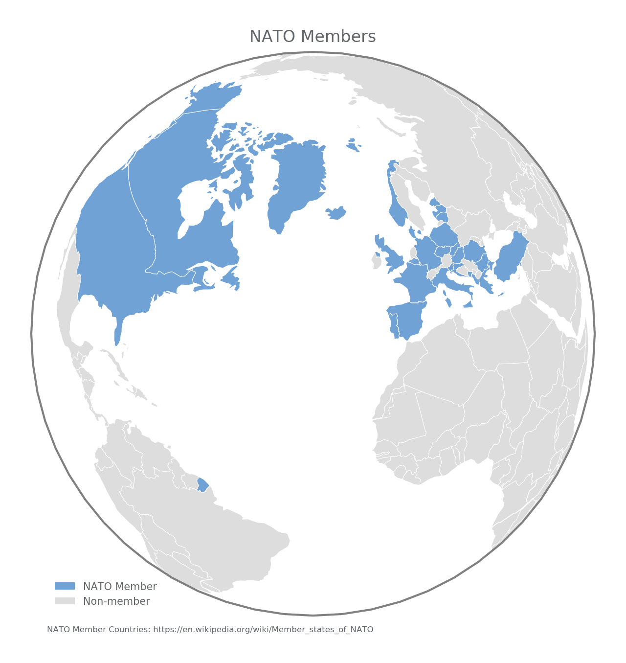
annotation = 'NATO Member Countries: https://en.wikipedia.org/wiki/Member_states_of_NATO'
title = 'NATO Members'
plot_countries(df,projection,colors,annotation,title,edgecolor='grey')
projection = ccrs.Orthographic(10,50)
colors = ['#000099','#DDDDDD']
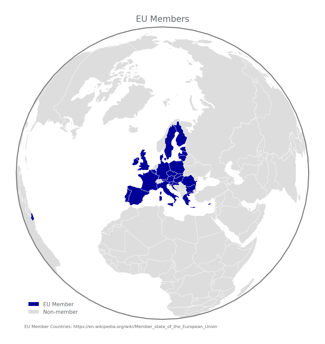
annotation = 'EU Member Countries: https://en.wikipedia.org/wiki/Member_state_of_the_European_Union'
title = 'EU Members'
plot_countries(df,projection,colors,annotation,title,edgecolor='grey')
print('Done.\n')
if __name__ == '__main__':
main()
Two interesting examples are to show EU Members (above) or NATO members (below).
Another interesting example is the world split into four regions with the same population (idea from mapchart.net).
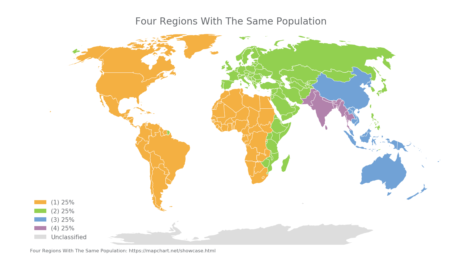
Note: I don't know how to highlight France without highlighting French Guiana (in South America). If you do, let me know.