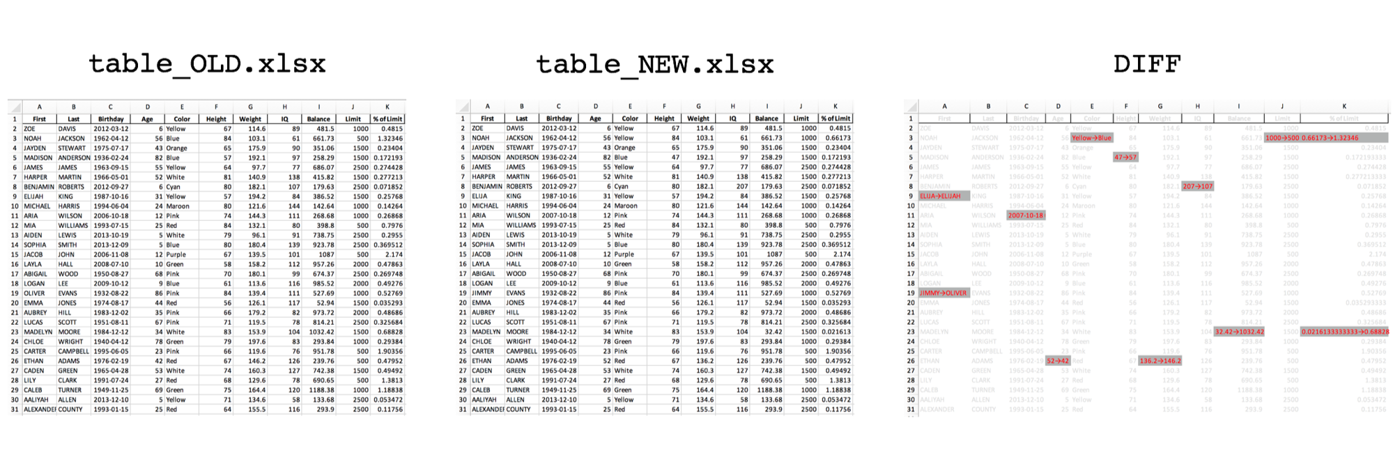
Matplotlib: Multiple Y-Axis Scales

Matplotlib's flexibility allows you to show a second scale on the y-axis. This example allows us to show monthly data with the corresponding annual total at those monthly rates.

The Matplotlib Axes.twinx method creates a new y-axis that shares the same x-axis. First we create an axis for the …

Python with the Google Maps API

The Google Maps Platform offers a number of APIs to get maps, routes, and places information. In this example, I will demonstrate how to get coordinates of an address using the Geocoding API.

Google Maps API

While access to the Google Maps APIs used to be free for small requests …

Book Value vs. Market Value Exposure Report

It is important for a capital business to understand the exposure on its books. Here is a quick visualization of exposure vs. market value using matplotlib.

Book Value vs. Market Value

The book value of an asset is the value recorded on a company's balance sheet. This value typically decreases …

Visualizing An Infant's Schedule

A newborn may only eat, sleep, and poop, but they sure do it a lot! Here is a sample of two weeks of an an infant's schedule visualized with matplotlib.

A while ago I came across a radial sleep schedule plot and thought it was a creative way to visualize …